Visual Effects in Literary Monthlies
Literary monthlies – the Atlantic, Harper’s, the Century, Lippincott’s, and Scribner’s – were some of the most widely read and highly respected magazines in nineteenth-century America. They don’t usually strike one as avant garde today, but I think that’s a misunderstanding for several reasons. For one, literary monthlies helped drive the development of new technologies and skills for reproducing illustrations. But they also expanded the possibilities of what illustrations could do. From the 1870s to the 1880s these magazines experimented with a number of visual aesthetic techniques that reimagined the relationship between text, layout, framing, and illustration (setting them apart from the more Victorian style of the leading illustrated magazines of the 1840s and 1850s, such as Graham’s and Godey’s). I find the results fascinating, daring, and even lovely, so here is my short paean to them.
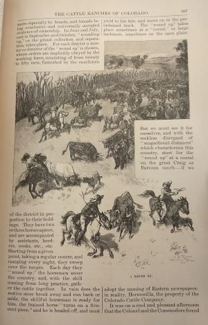
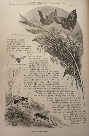
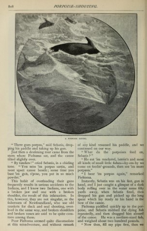
The most basic visual experiments in literary monthlies involve breaking an illustration’s frame and forcing idiosyncratic text-wrapping. The bull that breaks out of its frame above as if breaking away from its herd is a great example of how this technique could generate the impression of motion.1 Because the frame is obeyed in the background but broken in the foreground, furthermore, that movement appears as if coming towards us (here’s a porpoise depicted similarly).2 The second example above, with bugs and grasses, shows how this fairly simple technique could be deployed to achieve a different yet equally striking effect.3 Pressed into a diagonal by the illustrations on either side, the text takes the parallel shape of another branch and words begin feeling like the tiny leaves – or vice versa. Every border on the page, whether the margin of a group of lines or the rounded pseudo-frame at the top of the page, is penetrated or outjut. This variegation gives a sense of vibrancy that pairs with the speed with which the shortened lines of text can be read.
Illustrations of illustrations was another common convention. In the illustration to the right, for instance, a lightly-frayed sketch is pinned to the page and casts a shadow on it.4 The illustration-of-a-sketch thus not only depicts a scene but imitates the status of an artifact of that scene, a sketch made on-location to be catalogued. This doubling taps into the ethnographic imagination of the folklore, lyric, local color, and travel writing that literary monthlies constantly printed; no wonder these are the genres in which one most often finds this technique. It also invokes contemporary practices of making pressings in commonplace books or collages from cut-out magazine illustrations. Literary monthlies mimicked the collage form too to encourage readers to make their own and to simulate the associations of travel.5
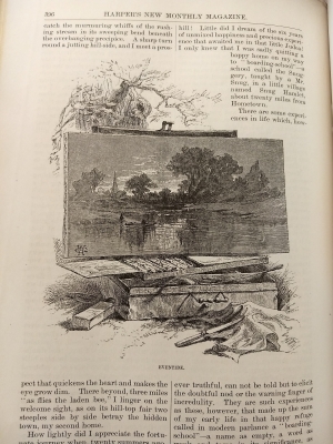
In the variation at left, the painting sits on its easel unfinished, still unfolding, like the narrative in which it is embedded.6 Note that the tree behind the easel is incongruous with the actual content of the painting, which reveals that the artist’s scene is either purely imaginary or an embellishment from an earlier sketch being carried out at a different location. As such, the illustration explores the disparity between local color art and the local itself. Is it just the artist who is portable? Or is the same style applicable to every locale rather than arising organically from it? Are locales themselves interchangeable? These are some of the same questions on which contemporaneous local color writing meditated.
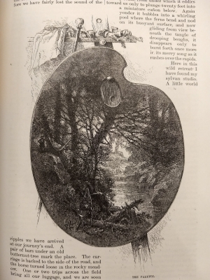
Here’s another riff on these ideas, except that now the landscape appears not as a piece of art but as the artist’s palette, with paint replicating nature as if on its own.7 The playful irony is that synthetic aniline dyes were at this time quickly replacing their precursors made of natural materials. The palette is “framed” by the text in a manner closer to the wildlife illustrations above, either asserting the completion of the painting despite its unorthodox “canvas” or reaffirming the idea that the painting is itself a kind of natural object. But if we look closely, we can see not only male and female figures but a painting of the same scene as the palette-painting. Which comes first, nature or its representation? It may well be frames all the way down, like a recursive mise en abyme.
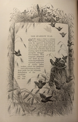
Why not reverse the formulas? Instead of the text appearing outside an illustration, here the text appears inside the illustration, as a page left in a field.8 It’s not only surrounded by nature but embedded in it – note the shadows cast on the page by the birds – at once an artifact and a product of nature being reclaimed by it. (It’s not entirely clear what the scale is here, between the size of the page, barley, and birds. But even this feels appropriate for a piece about the oversized environmental impact of a small invasive species.) This illustration is itself on a page, of course, which seems to invite us to take that page outdoors with us to read. Indeed, many famous advertisements for literary monthlies depicted just that. In doing so we replicate the nature-text relation on another scale.
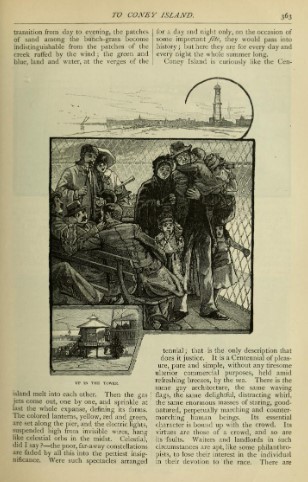
As has become clear, these techniques could be combined for ever more specific, multi-faceted, or novel effects. Each of these conjoined images of Coney Island, for example, provides not only a different view of the scene – close up, middle-distance, landscape – but a stylistically different kind of view: sociological, touristic, impressionistic.9 In other words, the illustration plays on the double meaning of “perspective.” The standard black border of the central images turns into the wood border of a souvenir below and above serves merely as the base of an otherwise open horizon before curling abstractly. It is a collage of techniques. Moving our eyes from one to the next we have to consciously shift visual scales and mental interests, a task characteristic of visual experience in the real world but typically abrogated by single-perspectival visual art. Obvious contrasts aside, this is an important affinity with cubism.
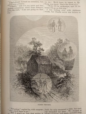
Here is a particularly zany one to wrap up with. “Passing Thoughts”-bubbles appear around or in a landscape that turns out to be just another big bubble itself.10 By way of this abstraction – and that of the gray lines that serve as a static background – it attempts to illustrate intangible thought and memory. The resulting visual becomes unusually though ambiguously narrative, depicting multiple events rather than one but not giving any clues about the order in which those events have happened or will happen. At the same time, the size of the landscape bubble relative to the smaller bubbles with people represents the continuity and stability of place relative to the events that unfold within it chronologically: a triumph, perhaps, of the geographical and the local over the narrative. This priority seems reaffirmed by the way the landscape begins to escape the confines of its bubble at the bottom of the illustration.
I’ve drawn these examples from just two volumes purely for convenience; similar illustrations abound in Harper’s, Lippincott’s, and Century/Scribner’s. Together, these experimentations with visual aesthetics amplify many of the thematic concerns that vitalized the literary monthlies in the 1870s and 1880s: the relation between art and artifice, instinct and education, real and romance, local and cosmopolitan. Over time, however, these particular techniques became less common. Mass commercialization of halftone photoengraving in the early 1890s sparked a major shift in the visual styles and techniques used in magazines. In the subsequent decade this group of publications looked more visually conservative as they repositioned themselves in response to competition from new magazine formats (ten-cent monthlies in particular, such as McClure’s and the Cosmopolitan) that offered illustrations at a lower cost.
-
Augustus Allen Hayes, “The Cattle Ranches of Colorado,” Harper’s New Monthly Magazine 59.6 (Nov. 1879), pg. 887. ↩︎
-
Charles C. Ward, “Porpoise-Shooting,” Scribner’s Monthly 20.6 (Oct. 1880), pg. 808. ↩︎
-
James C. Beard, “The Mimicry of Nature,” Harper’s New Monthly Magazine 59.6 (Nov. 1879), pg. 868. ↩︎
-
W. Hamilton Gibson, “Snug Hamlet and Hometown,” Harper’s New Monthly Magazine 59.3 (Aug. 1879), pg. 397. ↩︎
-
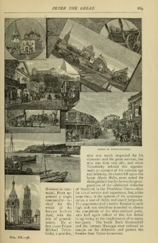
Eugene Schuyler, “Peter the Great IX.,” Scribner’s Monthly 20.6 (Oct. 1880), pg. 889. ↩︎
-
W. Hamilton Gibson, “Snug Hamlet and Hometown,” Harper’s New Monthly Magazine 59.3 (Aug. 1879), pg. 396. ↩︎
-
W. Hamilton Gibson, “Snug Hamlet and Hometown,” Harper’s New Monthly Magazine 59.3 (Aug. 1879), pg. 393. ↩︎
-
Henry Wood Elliott, “The Sparrow War,” Harper’s New Monthly Magazine 59.6 (Nov. 1879), pg. 848. ↩︎
-
William H. Bishop, “To Coney Island,” Scribner’s Monthly 20.3 (July 1880), pg. 363. ↩︎
-
W. Hamilton Gibson, “Snug Hamlet and Hometown,” Harper’s New Monthly Magazine 59.3 (Aug. 1879), pg. 403. ↩︎